How to create and read cross-tabulations.
If you want to compare two question, say look at how different roles rate the website or what the find score is for the different purposes, you can cross-tabulate. The cross-tabulation will give you two sets of information at the same time, and is good way to identify problem areas.
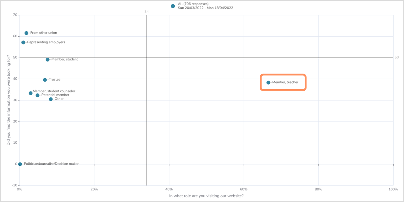
In the example below, the role is cross-tabulated with the find score. Each of the dots represent the share of the role and its find score. "Member, teachers" are about 67% of the visitors and have a find score of about 38.
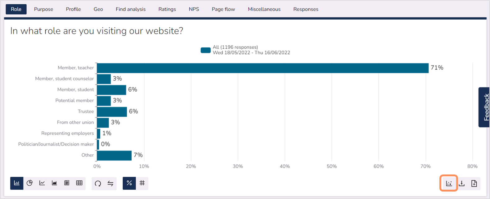
To cross-tabulate, you start with the question you want on the x-axis, or horizontal axis. In our analysis reports, that is usually a role or purpose question. In this example, the role question is used.
Next you click on the scatter plot icon in the bottom right corner. The will open the cross-tabulation.
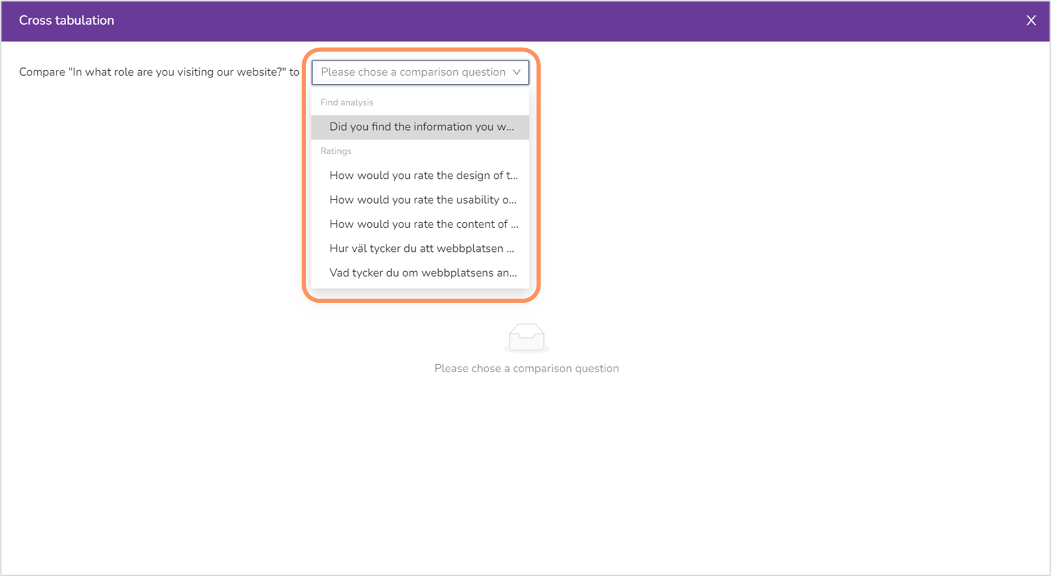
The next step is to select a comparing question. You can only select the KPIs, as in find score, ratings and NPS. In this example, we'll use the find score.
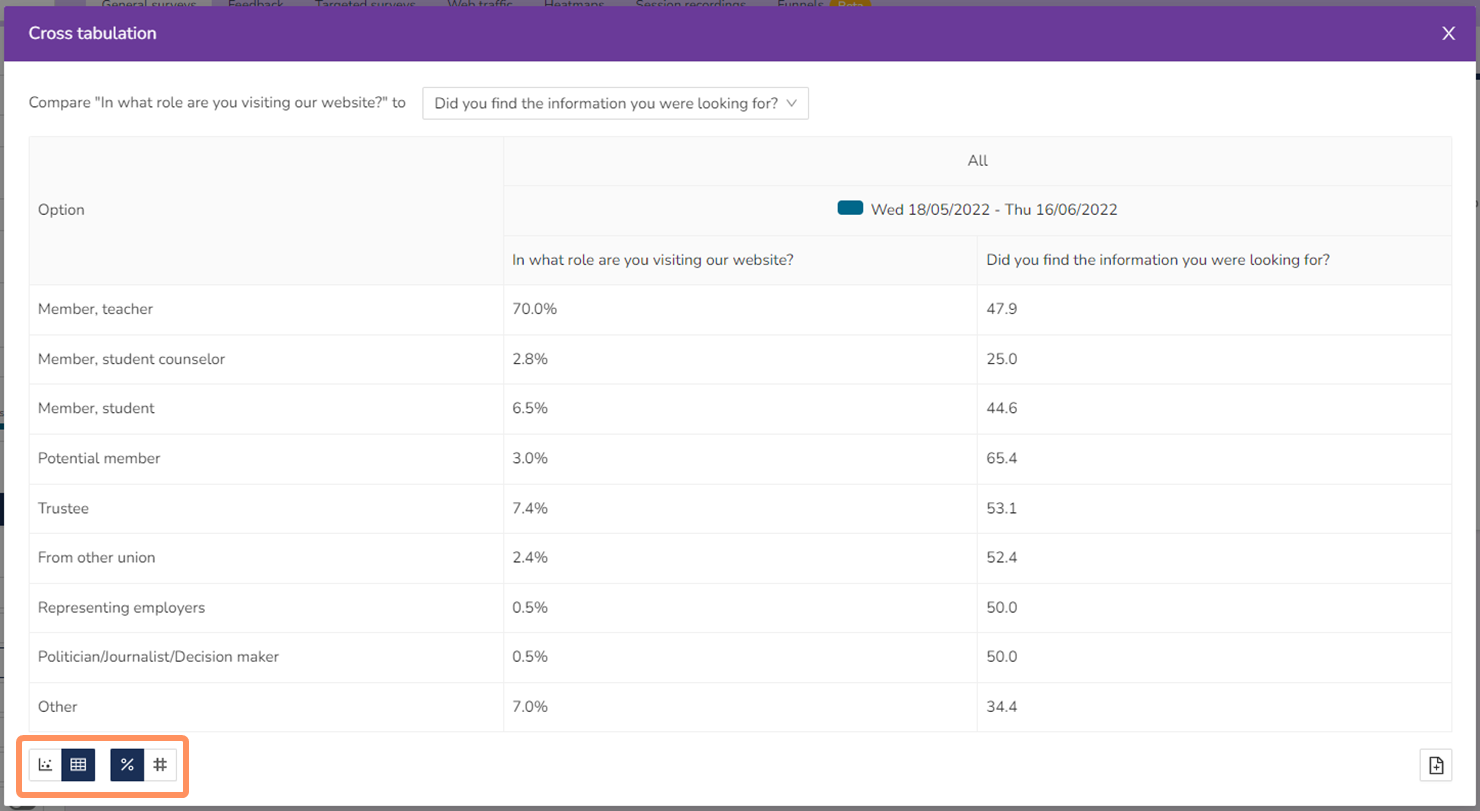
After you've selected the question you want to compare to, you will get your cross-tabulation chart. In this example, we have the find question presented as calculated scores (the KPIs are always presented as calculated scores in the cross-tabulation) on the vertical axis, and purpose question in percent on the horizontal axis.
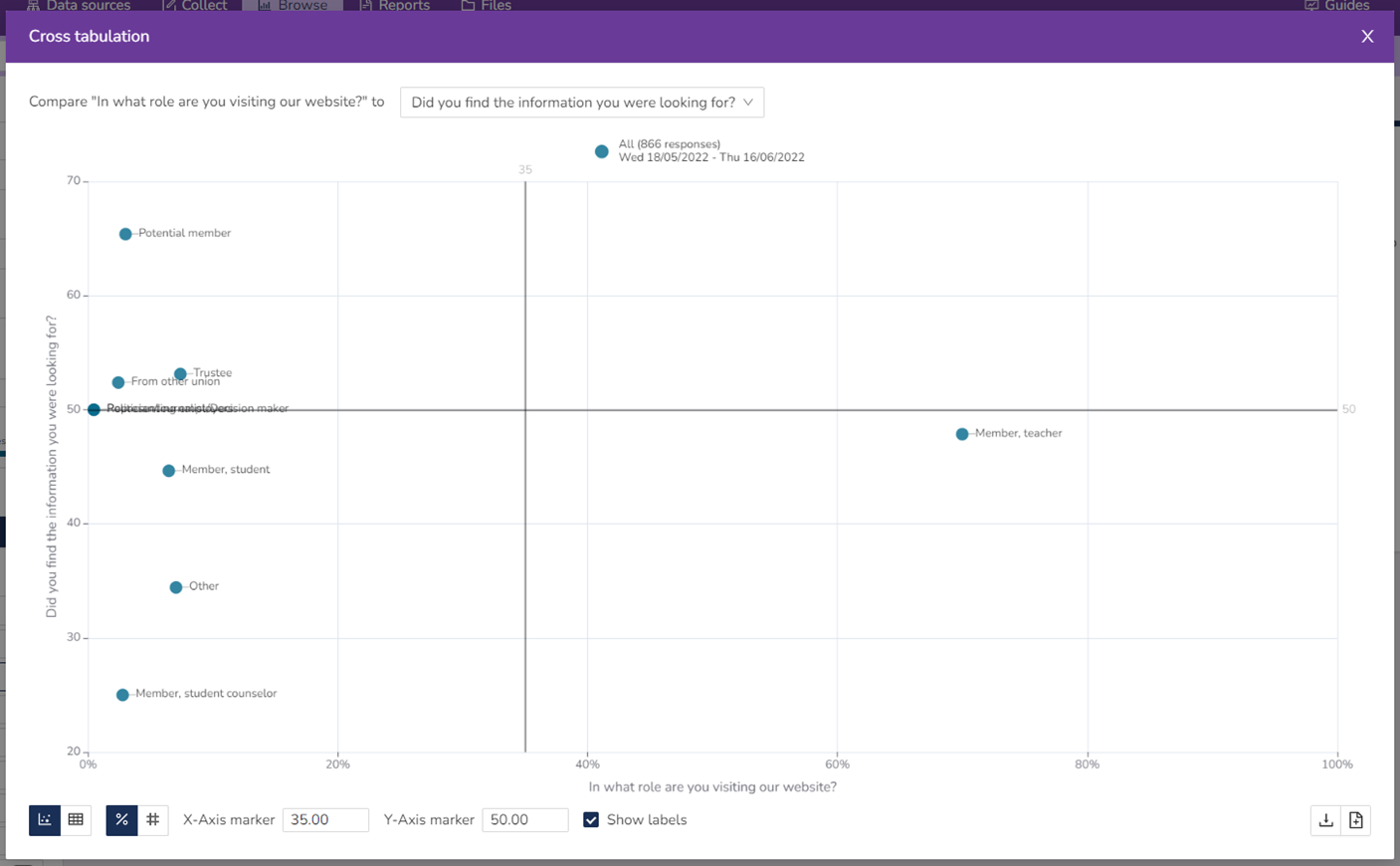
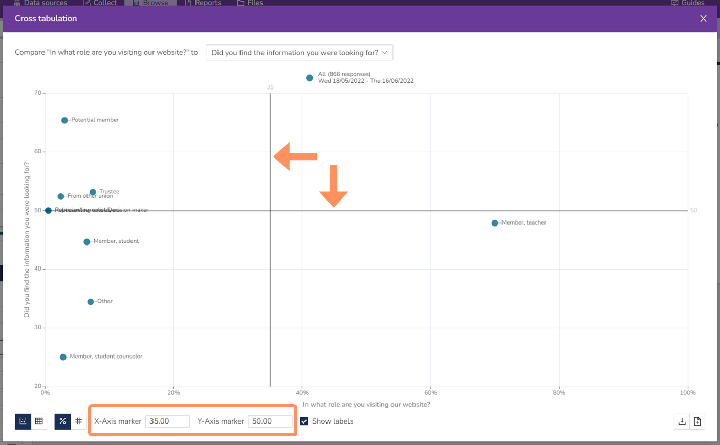
There are also two axis markers in the chart. The default settings are to have the y-axis marker at the limit for approved score (50 for find score, 3.50 for ratings, and 0 for NPS), and the x-axis marker is placed halfway between the biggest and smallest role/purpose/etc (in this example, the role).
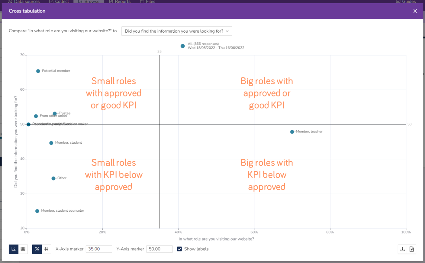
The axis markers divide the chart into four quadrant, all with different meanings. The top right quadrant are big roles/purposes/etc with an approved or good KPI. The bottom right quadrant are big roles/purposes/etc with KPI below approved. The top left quadrant are small roles/purposes/etc with an approved or good KPI. The bottom left quadrant are small roles with KPI below approved.
The axis markers make the analysis a bit easier, as they tell you what to focus on and where your effort is needed the most. The bigger roles/purposes/etc with a low KPI are more important then the smaller ones, at least generally (depending on the website).
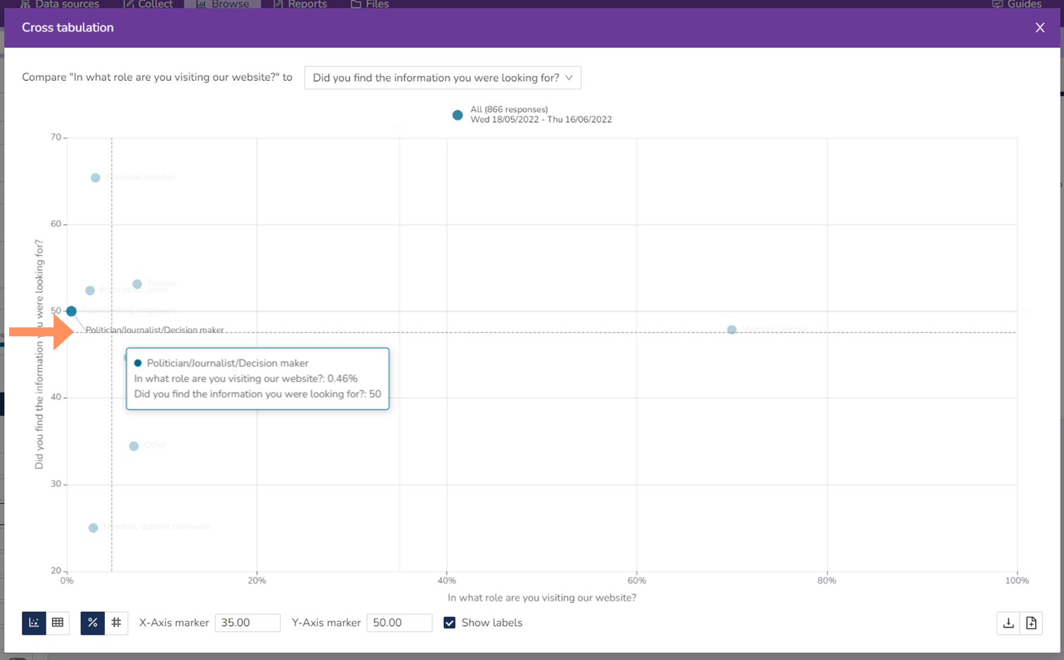
Sometimes you'll find that the labels overlap, but you can move them by clicking and dragging to a better placement.
Lastly, you can choose to view the data as a table instead. You can also choose between percent and number of answers, as for the other charts. This is of course not limited to the table, but you can see number of answers for the scatter plot chart too.