When you create your survey, you can change colors, add page breaks, and add a progress bar. However, the changes you make can affect survey responses.
You have a lot of options when you create a survey at Extellio. Not only can you choose between different question categories (such as single-choice or text answer), you can also adapt the design of the survey, for example to make it match you graphic profile.
In this article, we'll go through the design changes you can make and show how to use the settings, as well as discuss how different options can affect how your respondents perceive your survey, and therefore, how they answer.
Page break
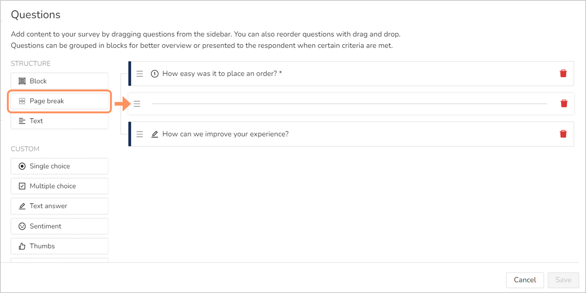
You can add page breaks to your survey, which means that you will divide the survey across several pages. You add page breaks as you do other survey content, by drag and drop. The page break appears as a line in your list of content.

Page breaks can be useful if your survey changes topic halfway through, as you'd then get a page with question about one thing, and a new page for questions about a different thing. However, page breaks can have a negative effect on the drop-off rate for the survey.
When you use page breaks, the respondents won't know how many questions there are, or what they are about, until they have filled out the first page and the move on the next. They won't even now if there is just one more page, or if there are five.
To encourage respondents to answer the full survey, it's usually better to skip the page breaks.
Progress bar
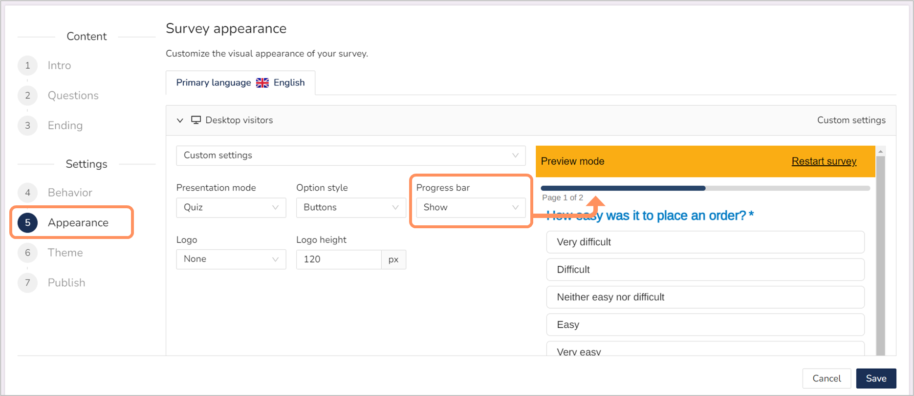
The progress bar lets the respondent know how many pages there are left to answer. If you want to use page breaks, adding a progress bar too is a great option.
The progress bar setting is found under "Appearance", and you can either "Hide" or "Show" the progress bar.

As the progress bar shows number of pages, it serves little purpose unless you also have pages breaks. The progress bar can have a positive effect on the drop-off rate (as in decrease it) as it helps the respondents understand what is expected of them.
However, if you have a very long survey and 4 questions per page and 10 pages, then the progress bar can make the survey feel overwhelming. But the problem isn't the progress bar, it's that you made the survey too long to begin with (web surveys should be kept short).
Theme
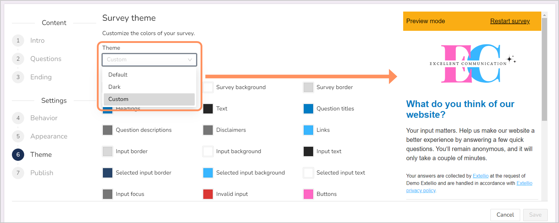
Lastly, you have the option to customize the theme for the survey. For the custom settings, you can change the colors of the elements, such as page background, text, links, buttons, and much more. There is also the option to add custom CSS.

Changing the theme is not necessary, but it is a way of making the survey match your graphic profile. In some instances, that can influence the response rate. If you have a messy survey, that can give a bad impression. Using bad color choices can also negatively affect the response rate, and an example of bad color choices is a low contract between text and background color. Having a survey that matches your website, on the other hand, will give a professional impression.
But you needn't worry too much about the theme. Our default settings are appropriate for all websites. And there's a dark mode option also.
How much does the appearance of the survey affect the responses?
Well, it depends. For a pop-up survey, a different design from the website might not matter that much, but if an embedded survey uses a different design, that could stick out like a sore thumb. Changing a few of the colors in the survey to match the website takes little effort, but it will give a cohesive and professional impression.
As for how you structure your survey, allowing for an overview of all the questions (no page breaks) decreases the drop-off rate, as the respondents are not "surprised" by even more questions.